Imagine two shoppers on a mission. One, curled up on a sofa with a laptop, adds a trendy jacket to her cart. The other, riding the morning train, tries to buy sneakers on a smartphone before the next stop. Both have credit cards ready. Yet, statistically, only about 2–3 out of every 100 online shopping sessions actually end in a sale. The rest vanish into thin air. Even more startling, nearly 70% of shopping carts are abandoned somewhere between “Add to Cart” and “Place Order”.
This is the last mile problem of e-commerce: an urgent challenge fashion, beauty, and electronics brands must solve to turn browsers into buyers.
Mobile vs. desktop.Two shoppers, two outcomes
We live in a mobile-first world, yet desktop still often wins the sale. It’s a curious paradox. Desktop shoppers convert at roughly 3.2%, versus ~2.8% on mobile. Mobile devices generate over 70% of e-commerce traffic for many brands, but those users tend to window-shop and wander off more frequently.
Why? Picture our train commuter juggling a phone and coffee, a slow page load or fiddly form field, and she’s one bump away from giving up. In contrast, our laptop shopper is comfortably typing with both hands, breezing through checkout. In the UK, more than half of adults now use mobile wallets for payments (57% as of 2024), and contactless card payments account for 61% of transactions. Clearly, mobile has become the storefront of choice.
However, mobile users are still more likely to abandon purchases due to slow pages or hard-to-fill forms. It’s the digital equivalent of a crowded, messy store. Customers simply walk out.
So, what’s the fix? It starts with empathy for the mobile experience. Think big buttons for thumbs, lightning-fast load times, and as few taps as possible between desire and delight. Some brands are even letting customers check out with a single touch: tap an Apple Pay or Google Pay button and boom, done. These “one-tap” accelerated checkouts can be 3–4× faster on mobile and have driven up to 50% higher conversion rates for retailers that adopted them. The message is clear: if mobile is the new norm, our checkouts must evolve to meet shoppers where they are.
Checkout UX. Turning friction into flow
Think of a checkout page as an airport runway. It needs to be long enough to ensure a safe takeoff, but any extra length or obstructions, the plane never leaves the ground. In checkout terms, every unnecessary field or step is an obstacle that can ground a purchase. Research shows that shorter, simpler checkout forms significantly boost completion rates. It makes sense. Ask only for what you truly need. Do you really need a fax number or a second address line? Each extra keystroke is an invitation for the customer to bounce. The Baymard Institute, which has spent years studying online shopping behavior, put it bluntly: each additional form field is another chance for the shopper to quit. So we streamline. We chunk long processes into bite-sized steps with clear progress indicators, turning a daunting marathon into a series of small, achievable sprints.
Now consider the psychological side. Surprise costs at checkout. Taxes, shipping, and fees that weren’t seen upfront are conversion killers. Hidden fees break trust; it’s like being told one price on the shelf and another at the register. Leading platforms like Salesforce and Stripe have found that displaying all costs (taxes, shipping options, and any surcharges) as early as possible markedly reduces last-second cart drops. In practice, that means showing shipping costs or at least an estimate in the cart, and highlighting any free shipping thresholds (“Add €5 more for free delivery!”) to encourage bigger baskets.
Perhaps the biggest UX mistake is one many brands still make: forcing users to create an account before buying. Imagine you’re in a physical store, arms full of items, and the cashier blocks the exit unless you sign up for a membership card. You’d probably dump the products and walk away.
Online is no different. About a quarter of shoppers will abandon their cart if forced to register an account. The fix? Offer a guest checkout option prominently. Let people buy first, and maybe then invite them to “create an account to track your order” on the confirmation page or via a follow-up email. You’ll still get their email and maybe their loyalty, but on their terms. In the same vein, make things like newsletter sign-ups strictly optional in checkout. This is a purchase flow, not a mailing list ambush.
Finally, think trust. The moment a customer is reaching for their wallet, any hint of insecurity can be fatal. Does this site look legit? Can I trust them with my card info? Simple cues go a long way: show a lock icon or “Secure Checkout” label, display familiar payment icons (Visa, MasterCard, PayPal), and even toss in a few customer review stars or a money-back guarantee blurb. These aren’t just decorations; they actively reassure anxious buyers at the final step. It’s the digital equivalent of a friendly, trustworthy salesperson giving a nod of assurance. And if there’s any complex info to convey (return policies, delivery timelines), consider a subtle “?” help icon or live chat bubble. Knowing help is just a click away can nudge a hesitant shopper over the finish line.
Payment methods. Let them pay their way
You’ve done everything right. The customer is sold on the product, breezed through your streamlined checkout, and is ready to pay. This is no time for a dead end. If the only payment option you offer is one they don’t have or trust, it’s as if they reached the register and found you don’t accept their credit card or mobile wallet. In fact, about 9% of shoppers will abandon a purchase if they can’t pay with the method they prefer. That’s almost one in ten sales lost simply due to not having the right logo on your payments page. The solution is straightforward: offer a variety of payment methods and tailor them to your audience.
Start with the basics: Credit / debit cards and PayPal are still the backbone of online payments. In the UK, for example, debit cards and PayPal together account for roughly 40–45% of e-commerce transactions. So you’ll want to support Visa, Mastercard, Amex, and yes, PayPal (which remains hugely popular for its buyer protection and one-click ease). Importantly for Europe, ensure compliance with the necessary verification steps for cards (your customers might meet an extra security prompt due to EU’s strict authentication rules. Better to implement it smoothly than to surprise them).
Next, digital wallets have surged from a novelty to a necessity. Services like Apple Pay, Google Pay, and Samsung Pay allow customers to check out with biometrics or saved details in literally a tap. These aren’t just flashy alternatives; they are conversion workhorses on mobile. Accelerated wallet checkouts can be up to 3–4 times faster than traditional card entry, lifting mobile conversion rates dramatically. Many shoppers now expect to see these options. In the Nordic countries, for instance, Apple Pay has quickly caught up with (and even surpassed) some homegrown mobile payment apps. In the UK, 57% of adults use mobile wallets. This is mainstream, not niche. Offering these one-tap methods means fewer typing errors, fewer redirects, and fewer chances for a distracted customer to drop off.
Then there’s the Buy Now, Pay Later (BNPL) revolution. Not long ago, splitting a purchase into installments was mostly for big-ticket items. Now, services like Klarna, Afterpay/Clearpay, and Affirm have made BNPL common for a £50 pair of shoes or a €30 cosmetic set. How common? Surveys show around 60% of shoppers (in the U.S. and similarly high in Europe) have used BNPL, and at least 61% of online retailers now offer installment payment options. Fashion and electronics, especially, have embraced BNPL. It boosts average order values and appeals to younger shoppers who prefer spreading out payments. If you add an installment option, do so responsibly (and be transparent about the terms), but know that it could capture that indecisive customer who balked at the full price upfront.
The takeaway: optimize your payment mix for each market. The payoff is huge: you remove the final barrier to conversion, letting customers pay the way they find easiest and most trustworthy.
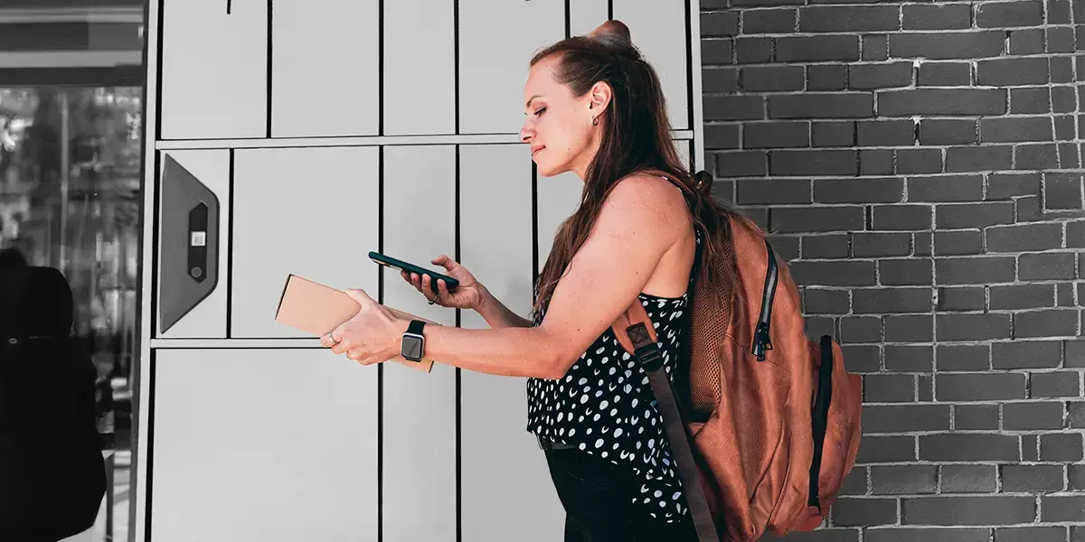
Delivery options. Shipping as the silent conversion lever
The moment of payment isn’t the end of the story; it’s the beginning of anticipation. Now the customer waits for that jacket, lipstick, or laptop to arrive. Checkout is not truly complete without clear, reassuring delivery choices. How you present shipping options at checkout can be the difference between a customer clicking “Place Order” or deciding to “save it for later” (which often means never). Research shows that about 75% of shoppers say that knowing an exact estimated delivery date positively influences their purchase decision.

Simply put, customers care when they’ll get their order, sometimes even more than the shipping speed itself. Baymard Institute found that shoppers value seeing a concrete date (“arrives by March 5”) over a vague speed (“Standard: 3–5 business days”). The certainty reduces anxiety. So, if possible, display actual delivery dates for each shipping option, or at least a tight range. This clarity builds confidence that the item will arrive in time, whether “in time” means a birthday, a holiday, or just before they leave for vacation.
Equally important is offering a spectrum of shipping options. There’s no one-size-fits-all: one customer might happily wait a week to save €5 on shipping, another might need it tomorrow, even if it costs extra. If you can, provide choices like economy, standard, express, and overnight, clearly listing the cost for each. Pro tip: if you offer free shipping at some threshold, make sure to advertise it. For example, if a shopper has €40 in their cart and your free shipping kicks in at €50, display a gentle nudge: “Add €10 more to get free shipping”. This not only reduces the sting of shipping costs but can actively increase your average order value as customers add a little extra to qualify for free delivery. Increasingly, retailers want to configure these delivery options at checkout themselves, market by market, without a developer.
Modern shoppers, especially in Europe, love flexibility in where their orders go. Home delivery is classic, but what about the customer who isn’t home during the day or the one who lives in an apartment with tricky access? Enter the rise of out-of-home delivery options: parcel lockers, pickup points at local shops, and “click and collect” in your own stores. These have exploded in popularity. Roughly 41% of EU shoppers have used click-and-collect or parcel locker pickup for online orders. Younger shoppers, especially, are embracing it. About 27% of Gen Z prefer picking up from a locker or store rather than home delivery.
One more silent conversion lever. Communicate the post-purchase experience at checkout. Promise (and deliver on) things like tracking notifications, easy returns, and reliable packaging. Even a note like “We’ll send you tracking updates and ensure your order arrives safely” can reassure someone on the fence. It’s like you’re saying, “We’ve got you – from checkout to doorstep.”
Personalization and localization. One size fits one
All checkout optimizations ultimately serve a single goal: to make each customer feel confident and comfortable clicking buy. What better way to do that than tailoring the experience to them? Let’s consider a small twist in perspective: the best checkout isn’t just efficient, it’s personal. It’s the online equivalent of a friendly shopkeeper who knows your name, remembers your usual order, and has already gift-wrapped your item by the time you reach the counter.
How can an impersonal digital interface feel personal? Start with the data you have. If a customer is logged in or you’ve seen them before, pre-fill whatever details you can. Did they ship to a London address last time? Their postcode is probably the same. Have it ready. Is their name and email known? Don’t make them type it again. This isn’t just convenience; it signals “we know you, and we value your time.” If their device has an autofill capability, make sure your form plays nicely with it. Nothing is more satisfying than tapping an address suggestion and watching all the fields magically populate.
Next, consider smart suggestions and timely offers. The checkout stage might seem like an odd time to sell more, but done right it can feel helpful. Think about Amazon’s classic “People who bought X also bought Y” prompts or the friendly barista who asks if you’d like a pastry with your coffee.
Cross-selling and upselling during checkout can boost average order value significantly. One study found it can lift order values by about 42%, and even increase customer lifetime value by 20–40%. The key is relevance and subtlety. If the customer is buying a laptop, suggest a sleeve or an extended warranty (not a random desktop monitor). If they’re buying a dress, maybe show the matching scarf or earrings. In the beauty sector, this could be a gentle “Complete the routine: add the toner for €15.” These personalized nudges not only increase sales; they often enhance the customer’s satisfaction (“Good call, I did need that accessory!”). The trick is to frame it as service, not upsell, and always give an easy “No thanks” option.
Personalization goes beyond product recommendations. It’s also about speaking the customer’s language, literally and figuratively. If you know a shopper is in Spain, don’t show English by default; greet them with “Hola” and show prices in Euros. If your customer is in Germany and you’ve detected this from their shipping address, you might display a note: “We support Sofort and Giropay for easy bank payments,” right alongside the standard Visa/PayPal logos. That signals “we get you, we built this for customers like you.” In fact, adapting to regional norms is a form of personalization at scale.
On that, you can also read our Win at Checkout guide.
Finally, personalization can extend into how you follow up. Remember that many shoppers use guest checkout. That’s fine. We welcomed them in without strings. But that doesn’t mean we say goodbye forever. A smart, personal touch is to send a post-purchase email that feels genuinely helpful: “Your order is on its way! By the way, we’ve set up an account for you to track your orders and earn rewards, if you want to activate it.” This way a one-time buyer might become a loyal repeat customer, because you made it easy and appealing to stay in touch. It’s akin to a shopkeeper handing you a loyalty card with your receipt and saying, “Next time, you’ll get a discount.” Not pushy, just inviting.
But by applying these optimizations, mobile-friendly design, frictionless UX, diverse payment options, transparent delivery, and personal touches, that tiny fraction can grow. Many brands in fashion, beauty, and electronics have clawed their way from a 2% conversion rate to 3%, 4%, or higher. Every percentage point uptick means millions in extra revenue and thousands of happier customers.